Projects: Public
New Children's Museum
San Diego, California
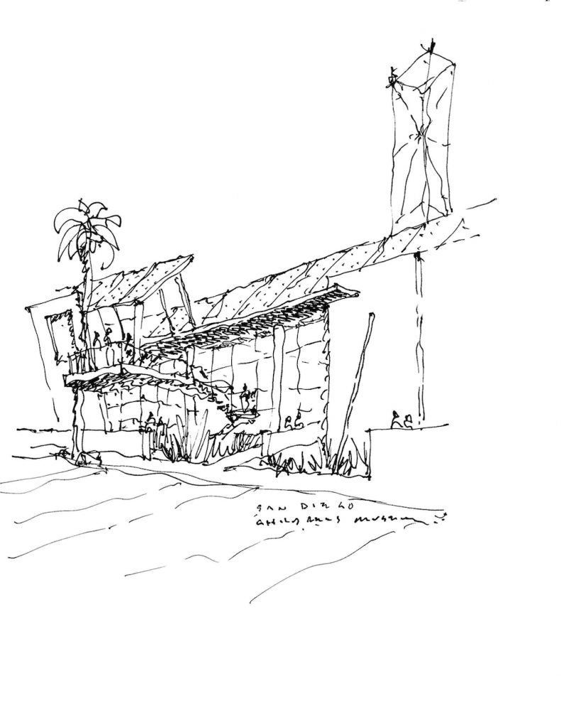
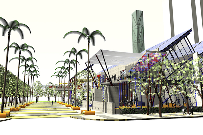
The New Children’s Museum is a three-level 50,000-SF building located on the north side of Island Avenue between Front and Union Streets. Like the art-oriented children's activities within, the architecture seeks to engage and educate the users.
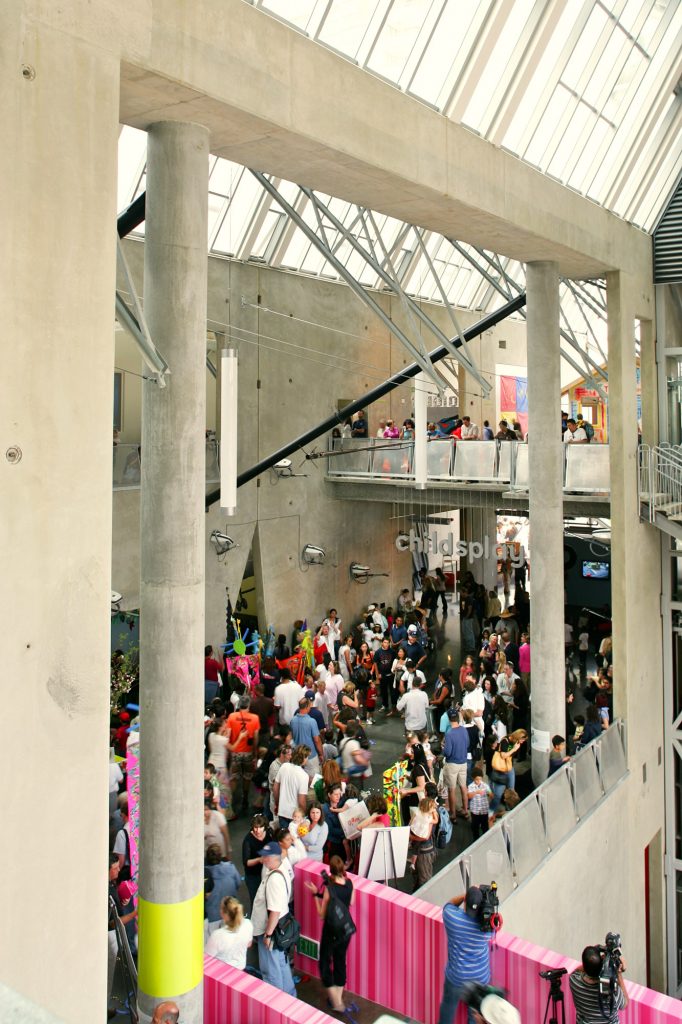
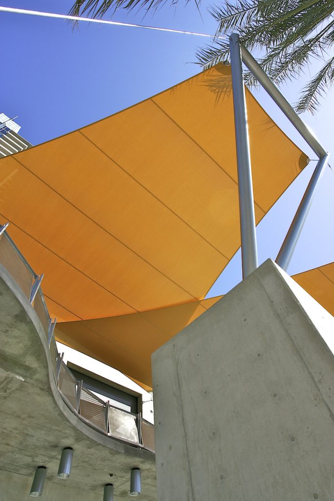
The Museum is a series of transparent, flexible spaces visible from and interacting with three city streets. Linear concrete walls divide the open galleries at 25’ increments, a reference to the original city real estate grid and also to the striped form of the adjacent Martin Luther King park.
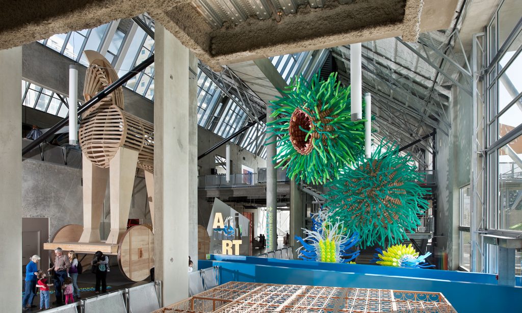
The massive walls act as thermal heat sinks to moderate the temperatures inside the building. Exposed 'temporary braces' holding the tilt-up panels illustrate and teach concepts of gravity and structure (as well as deal with a tight budget). A central glass chimney contains a transparent elevator and distinguishes the building from the surrounding commercial and residential uses. The chimney is also a cooling tower, which exhausts hot air from the naturally cooled and heated gallery spaces. In fact, mechanical HVAC is completely absent in the major public spaces. Natural daylighting is a major design strategy for economic as well as health reasons. The majority of the gallery and staff spaces are naturally day lit, augmented by rooftop photovoltaic panels. The architects worked with scientists and engineers at UCSD to create a building which will set a new standard for urban green architecture.
The roof is designed with the same artistic care as the facades. No mechanical equipment is visible from the surrounding high-rise buildings.
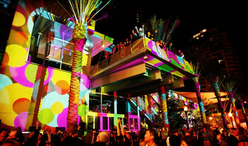
A vibrant and interactive children's park by landscape architects Spurlock/Poirier complements the building . The museum and adjacent park provide a civic anchor for Island Avenue – perhaps the area's most important east/west pedestrian street. A large second-level balcony overhangs the city sidewalk and engages the street and park.
The street between the museum and park remains open to cars but can be safely configured as a temporary pedestrian plaza for special events and, in fact, has been the site of some of San Diego’s best parties!
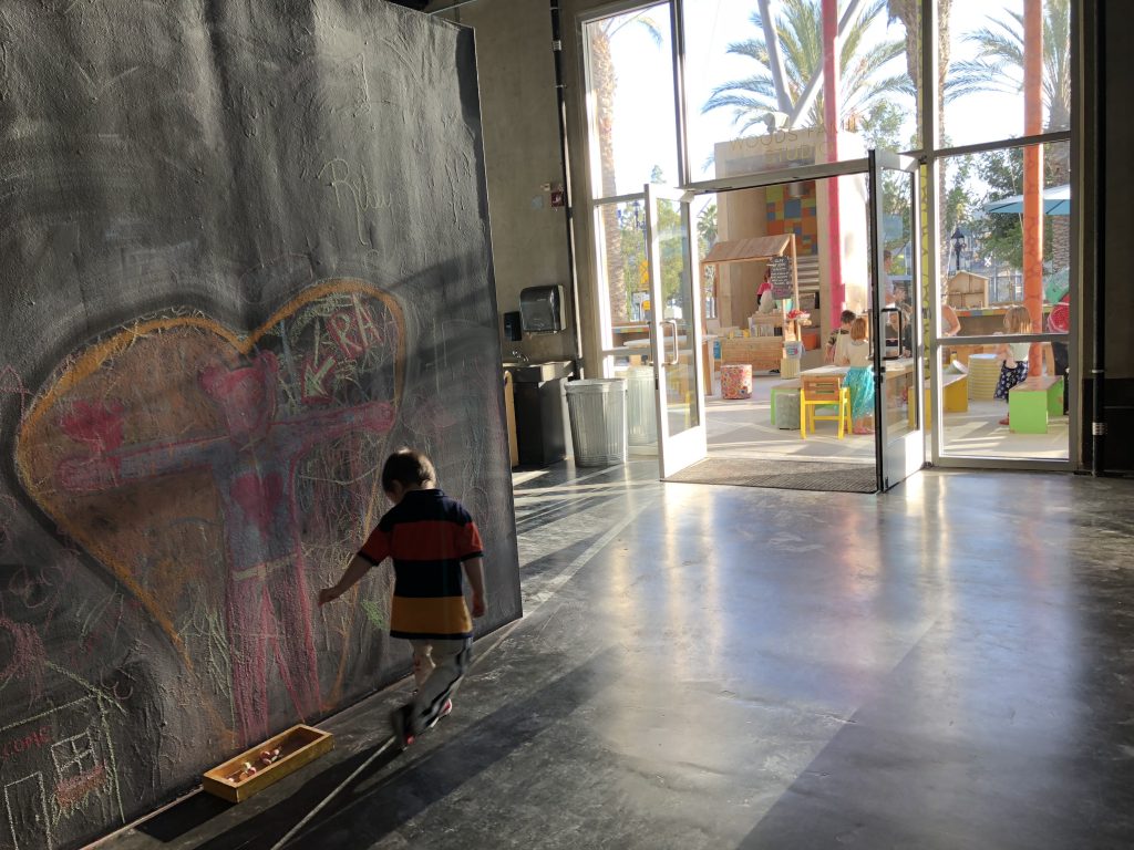
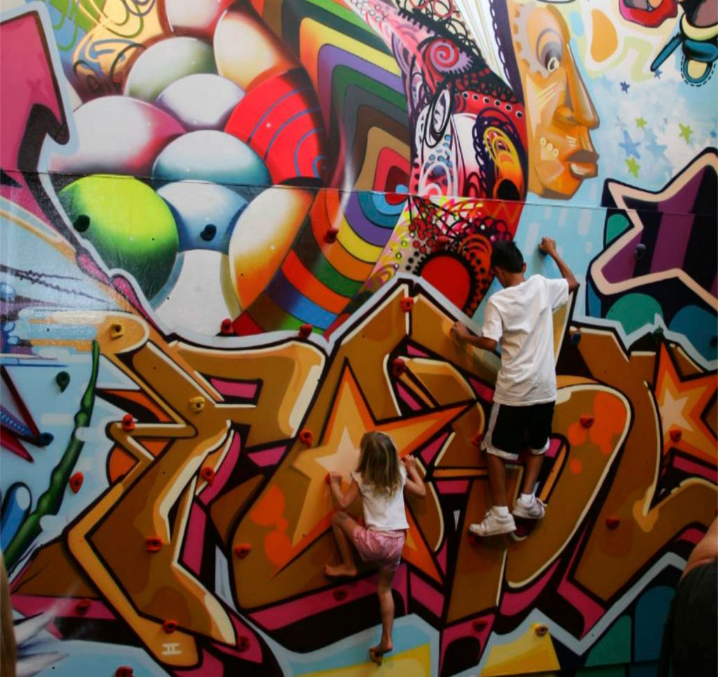
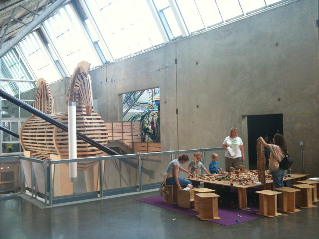
While the architecture has a lively interaction with the surrounding city and adjacent park, the interior is more subdued and neutral. More the “picture frame” than the picture itself, the building encourages energetic and uninhibited contributions from busloads of young Picassos.
Our design strategy involved addressing seven architectural paradoxes.
URBAN: fits but it doesn't
The building is intended to fit comfortably and predictably into the city grid but is also acts as a destination and civic focal point. A background building that is a foreground building.
EMOTION: very serious joy
This is a lighthearted place of joy and laughter but at the same time takes education and art very seriously.
PERMANENCE: kinetically static, delicately muscular
The exposed concrete and steel feel solid, timeless, muscular and static, while the tilt-up construction, open plan, leaning wall and animated staircases are choreographed to create light, airy, delicate and kinetic spaces.
SCALE: monumentally petite
The horizontal scale (inspired by downtown's original real estate divisions) is petite and domestic while the vertical scale is dynamic and monumental.
EDUCATION: neutrality with personality
The spaces are neutral, flexible and fluid to allow for spontaneous events and changing art yet the building has a strong architectural personality. The architecture both illustrates the physics of gravity and earthquake and tells the story of its own construction with exposed connections and materials.
COMMUNITY: together alone
Circulation and spaces are carefully choreographed to be open, theatrical and communal, yet allow for private areas and retreats. Children can be “alone” if desired while being observed from the various levels.
ENGAGEMENT: respectful inhibition
The building is intended to command respect but give permission.
It's just a warehouse.
Facts & Figures
ARCHITECTURAL SERVICES: PROGRAMMING, CONCEPTUAL DESIGN THROUGH CONSTRUCTION, GREEN / SUSTAINABLE DESIGN
Awards
2009 AMERICAN CONCRETE INSTITUTE, SAN DIEGO CHAPTER / COMMERCIAL/INDUSTRIAL/TILT-UP BUILDING AWARD
2009 TILT-UP CONCRETE ASSOCIATION / TILE-UP 'EXCELLENCE IN ACHIEVEMENT' AWARD
2009 CONSTRUCTION COMMUNICATIONS / COMMUNITY SERVICE AWARD
2008 AIA CALIFORNIA COUNCIL / HONOR AWARD SAVINGS BY DESIGN ENERGY EFFICIENCY INTEGRATION
2008 AIA SAN DIEGO / COMMITTEE ON THE ENVIRONMENT (COTE) AWARD
2008 URBAN LAND INSTITUTE, SAN DIEGO/TIJUANA CHAPTER / SMART GROWTH AWARD
2008 ASSOCIATED BUILDERS AND CONTRACTORS, SAN DIEGO / EXCELLENCE IN CONSTRUCTION AWARD
2007 SAN DIEGO ARCHITECTURAL FOUNDATION / ORCHID


